Commercial Research
The owner wanted not only to update the brand, make it more expensive and cross the "Medium+" level, but also to find out what new horizons the business could open for itself. Roughly speaking, we took the customer's main ideas, goals, and dreams and showed how they could be combined under the brand aegis.
So, we identified four main areas to develop the brand Hookah Bro. In this commercial research, we analyzed the main competitors in the areas and derived their strengths and weaknesses.
The four main areas: 1. Manufacturers of hookahs, tobacco, merchandise, and accessories. 2. Bro hookah, and coffee house 3. Bro auto-detailing 4. Bro festivals and parties
At the end of each section, we made some comparative graphics to understand the market situation. Such a presentation allowed us to clearly understand the current position of Hookah Bro on the market and work out the strategy for further brand development.
Brand Book
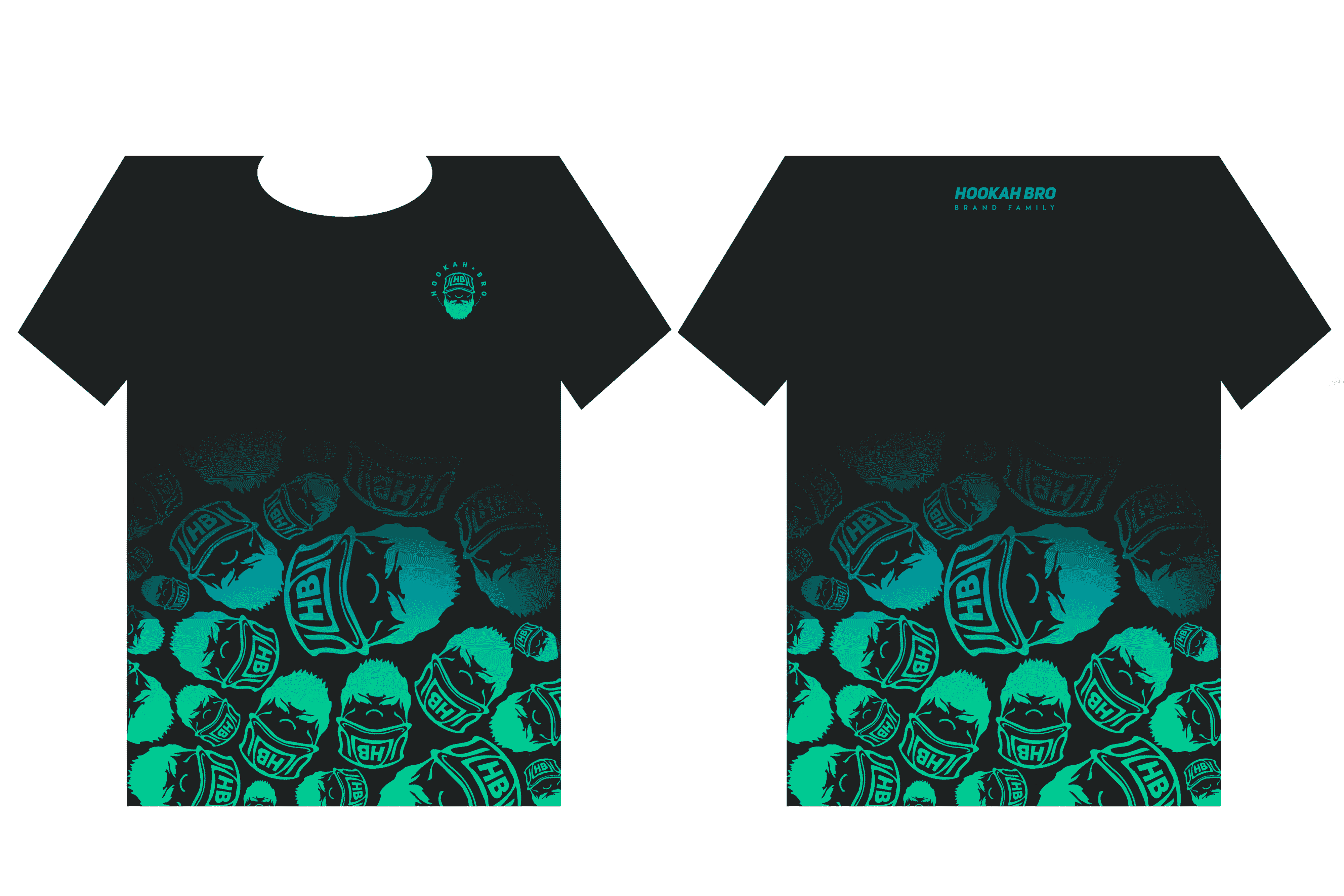
- Next, we began updating the visual part of the brand and creating a brand book. The first thing we did was to update the logo: we converted it to a vector, chose new colors — gradient instead of red, black, and white, and began to apply it to all kinds of materials.
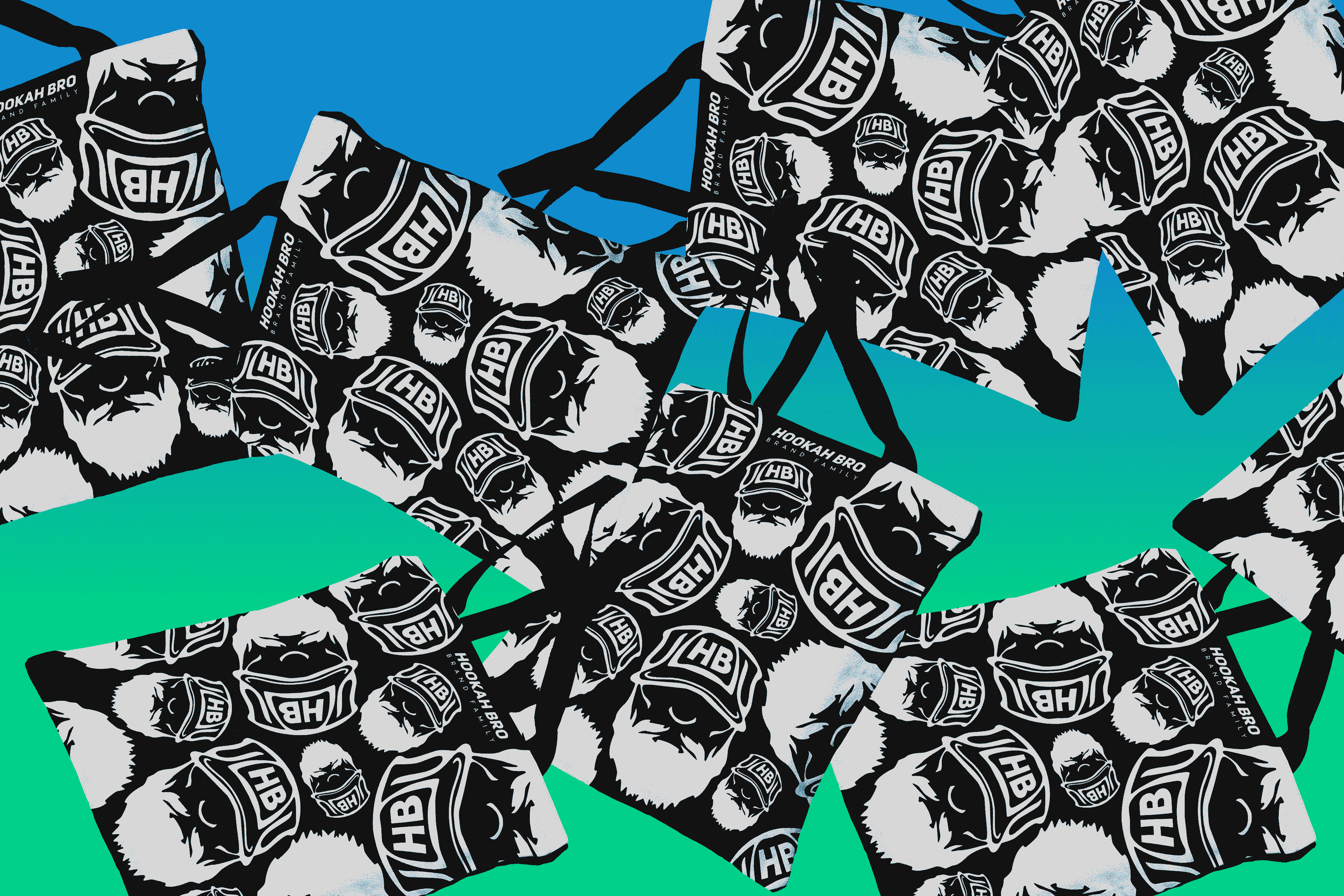
- Also in the brand book were branded fonts for use in the identity, developed a pattern using the logo without the text part.
Packaging & Merchandise
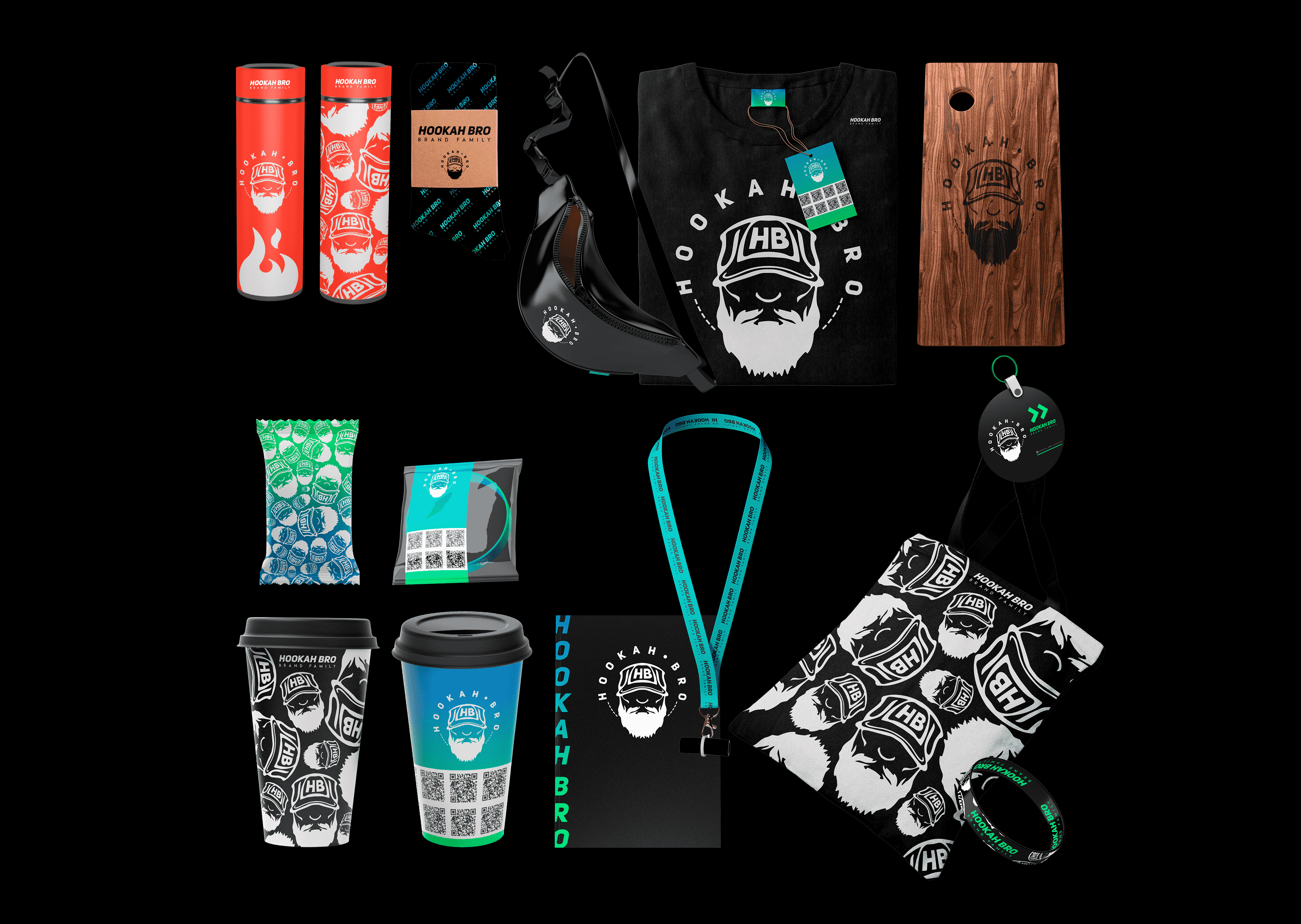
A tobacco manufacturer must be recognizable and memorable from the first touch, so we also developed packaging designs for each flavor. It turned out to be bright and stand out from the others: to do this, we reversed the Rainbow Blue gradient on the pattern, and voila!
One of the steps was to design the paper coffee cups. The main thing is a large number of QR codes to attract attention. We also showed examples of using the pattern on merchandise: t-shirts, shoppers, thermoses, bracelets, notepads, mouthpieces, and other gift "perks".
Results
- It was quite a long job: we went all the way in 6 months. We presented a new design block to the client about once a week, to which we made adjustments and refinements. This is an incomparable experience and a good testing ground for new techniques and approaches to creating each area.
- In the end, the client was most satisfied because we not only renewed the visual component, but also demonstrated a wide range of opportunities for business development and opened new ways to increase brand awareness.
Other cases
IZIBIZI Pasta Bar
Davaiwok
Beauty space EKABEAUTY Kharkiv
DISCUSS  THE PROJECT
Leave a  request
- Write to us artmarks.digital@gmail.com
- or call +38 (050) 617 67 08